
(Photo Credit: NHL Bruins)
By: Evan Michael | Follow me on Twitter @Evan007onTV
In honor of the recent unveiling of the Boston Bruins 2019 Winter Classic logo, as seen above and in the tweets below, I’ve taken it upon myself to reminisce on and rank what previous logos have been just as iconic, reverential and memorable over the years for the boys in Black N’ Gold (and these are the logos outside of the current & most familiar one the team has used for forever).
LEAKED: Bruins Winter Classic Jerseys Revealed https://t.co/S9W8LgvWMw via @nahstrom
— Thomas Nyström (@nahstrom) September 5, 2018
Bruins Winter Classic Jersey History and 2019 Concept https://t.co/GOac0y18eH
— Jeff Frias 🛡 (@SourceFrias) July 26, 2018
Sure, there were some real duds among the studs when it came to representing the Spoked-B, the Bruin bear and the team’s overall look on occasion. But I’m saving those for a follow-up article. In this space, right now, we’re all about the logos and looks that perfectly captured, and encapsulated, the B’s from their illustrious beginnings to today (again, these are some of other ones that inspired what we all recognize as the Bruins logo of then & now)!
1924: The Original
![]() (Photo Credit: The Hockey News)
(Photo Credit: The Hockey News)
You can’t even begin a conversation about the best team logos unless you start at the beginning, so that’s where we start — the B’s inaugural season in the NHL, 1924-25. Back then, it was the “Brown N‘ Gold” and the “Big, Bad, Bruin” didn’t really look all that big & bad. She was definitely more docile during the Coolidge administration, yet somehow still looked pretty darn cool sandwiched between the words “BOSTON” and “BRUINS.” But the real cool factor about this original team sweater was how it was literally and figuratively woven into the B’s fabric of history during the 2016 Winter Classic, as seen below. Never before have the colors of black, brown, gold & white ever gone together better, in my humble hockey opinion (if only that game could’ve gone a little better).
(1924-25 Bruins Jersey worn by George Redding / 2016 B’s Winter Classic Jersey worn by David Krejci, Zdeno Chara & Tuukka Rask – Photo Credits: Pinterest & SB Nation)
1932-1934: The “B”-ginnings


(Photo Credits: Sports Logo History)
It took almost a decade “B”-fore the team changed it’s bear-centric logo to that of the familiar big “B” that would stay with Boston until the now iconic Spoked-B debuted in 1948. I’ve always loved the sheer simplicity and boldness of this logo, as well as the symbolism “B”-hind it (be it in Brown N‘ Gold as it first was or the familiar Black N’ Gold version a few years later). And it didn’t even look too boring or misplaced when the team only used it on the sleeves of the jerseys and featured centered numbers on the front and back, as you’ll notice below from the changing looks of Tiny Thompson during the late 30s and early 40s.
(Photo Credits: Puck Planet)
This simple yet effective logo would make a cameo in Boston again for the 1991-92 season, with the NHL 75 patch joining it (I’m quite proud of my Andy Moog vintage jersey from this year pictured below in all its glory). And as we know from recent social media posts, it will “B” back in a slightly updated yet historically nuanced form for New Year’s Day in Notre Dame.
(Photo Credits: Evan Michael)
I like the color scheme. Old school jersey like Dit Clapper and Eddie Shore. #NHLBruins #WinterClassic #BruinsFam pic.twitter.com/dvzuVhECEV
— Mark Allred (@BlackAndGold277) September 5, 2018
As our esteemed colleague @BlackAndGold277 tweeted, this will indeed be an occasion and logo look well worth (Dit) Clappering over (if the B’s can Shore up who gets to debut it first)!
1949: The B-Spoken Word
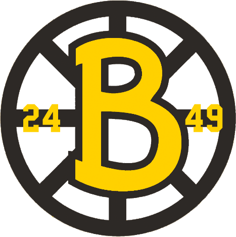
(Photo Credit: Sports Logos)
The B-Spoked “B” speaks! Yes, during the 1948-49 Bruins season, the first ever version of the now famous spoked-B was unveiled in honor of the team’s 25th anniversary in the NHL. Hence, the numbers 24 and 49 to the left and right of the emblazoned Gold ‘B‘ in the center representing the team’s aforementioned first year in the league, and the current season at the time. And, oh what a time the infamous Kraut Line had wearing it that year, especially B’s Captain Milt Schmidt who ranked it as one of his favorites.
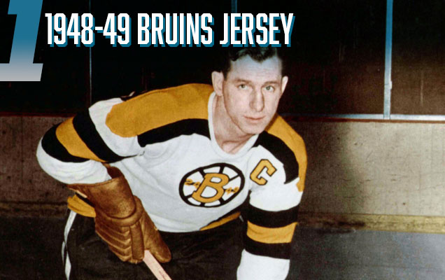
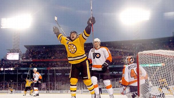 (1948-’49 Bruins Anniversary jersey worn by Milt Schmidt [top] / 2010 Bruins Winter Classic jersey worn by Marco Sturm [bottom] – Photo Credits: Hockey By Design & ESPN)
It was also a lucky favorite of former Bruins forward Marco Sturm, who wore a modernized version of it for the B’s first Winter Classic contest back in 2010. His overtime Fenway Park game-winner is quite the legendary goal in recent team history. In case you need reminding:
[youtube https://www.youtube.com/watch?v=MxQ2V2CE7b4]
Meanwhile, how was that for a reminder, or better yet, stroll down memory logo lane for the B’s and some of their featured & favorite jerseys? There’s nothing like looking forward to a preseason look back on likable looks for your most-liked team to get you in the hockey spirit lickety split! And like I mentioned earlier, of course there are others that we all recognize, admire and love to see. But, these few I think set the stage–and standard–for all the others. And they certainly started a recurring theme for anytime Boston plays a Winter Classic game, be it on the road or at “home.”
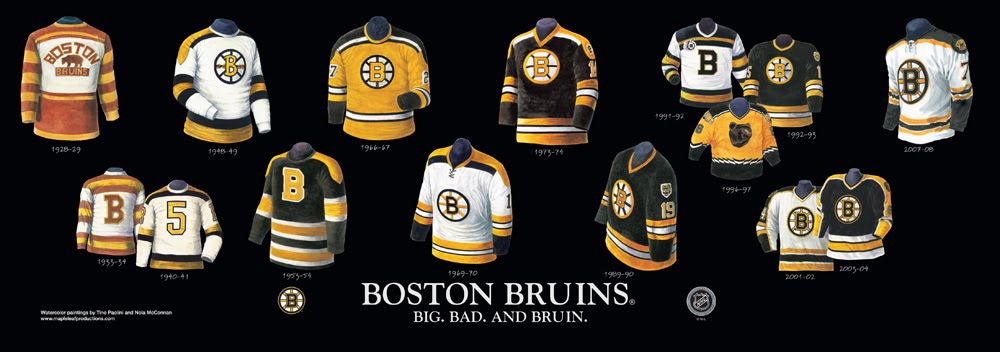 (Photo Credit: Heritage Sports)
What are some of your favorites? Let us know by commenting or sharing across Facebook, Twitter and your best B’s blogs & websites! #BestBruinsLogos

0 Comments
5 Pingbacks