By: Nathan Anderson | Follow me on Twitter @dairybeast
Background
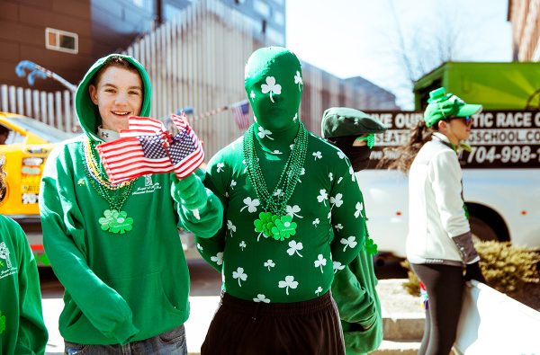
It’s time for part two of my series designing a potential city jersey for the Boston Bruins, and I think I like this creation even better than my first. While the first design focused on Boston’s place within history, this time, I decided to focus on the history of the people who call Boston home. Boston has a history of Irish descent, as referenced by the NBA team, the Celtics. I decided that the Irish heritage route would be a good path to take for my second attempt at a jersey that captures the spirit of the great city of Boston.
The Design
My first thought when designing the jersey was to use the colors of the Irish flag. However, I quickly ran into a problem with that when I remembered that I don’t like the combination of orange and green. I don’t think they really compliment each other well. Therefore, I had to think of another option to pair with the green that I wanted to use as my base for the jersey.
I thought about doing a second tone of green, but the Celtics recently used a uniform like that as one of their alternates, and it really did not work. I also wanted a more classical Irish feeling with the uniforms, and I quickly realized that using two green tones would essentially give the opposite effect.
I settled on using gold as my accent color. I can’t exactly explain it, but gold felt like it gave the jersey a vintage look that paired itself well with the font I used for the numbers and names on the back of the jersey. I also realized that the current eight-spoked “B” would not suffice for these uniforms, as it would throw off the feeling of the jersey. I decided to use the same font as I did for the names and numbers to replace the “B” and recolored the spokes to create what I think turned out to be a pretty solid logo!
I’ve been mentioning this font that I keep using, so I figure I should reveal it. It is a font called Meath FLF that I found by googling “Celtic fonts.” I think it worked really well for my purposes, and I’m happy with how it turned out. On the shoulders, I thought about doing a funny little pooh bear logo and adding a leprechaun hat to make him Irish-looking. I ended up scrapping that idea, though, but I could always redesign the uniforms and add those to the shoulders if anyone is curious to see it!
My final design features a recolored clover, which I hope conveys the purpose of the design in a straightforward way. I think I’ve done enough explaining of the design at this point, so all that is left is to reveal it! Without further ado, I present the Boston Bruins Irish City uniform.
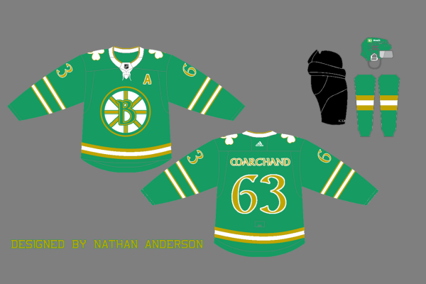
As you can see in the design, I went for two small stripes on the arms of the jersey. One of the goals I don’t think I mentioned in my previous article was to create jerseys that aren’t just recolored versions of the Bruins’ current ones. I thought the slim double stripes created a sleek look for these uniforms.
I designed the socks to mimic the hem of the jerseys, which is a single stripe in the same style as the arm stripes. I thought about adding multiple stripes to both the hem of the jerseys and the socks, but I didn’t want them to be too cluttered.
As always, I would welcome any feedback on the uniforms! I would love to hear other ideas as well about what I could base my next design on. I’d also like to hear which one of my two current designs you like the best. Thanks for reading!

Leave a Reply