By: Nathan Anderson | Follow me on Twitter @nathandrsn
Among all the offseason news in the NHL this summer, the most interesting to me is the announcement that Adidas will no longer make and design the league’s uniforms after the 2023/2024 season. Adidas has done a pretty solid job with the jerseys since their introduction in the 2017/2018 season. They have adjusted many teams’ designs over their five seasons, with more changes coming next year.
Among their chief successes, in my opinion, was their subtle and smooth transition from the Reebok Edge style back to vintage designs across several teams in the league. The Sabres, Flames, Coyotes, and Senators all reverted back to older designs that are better than what they wore in the Reebok era. They have also gone forward, though, bringing two new teams into the league and adding a few much-needed alternate uniform options for a few teams.
Of course, the first question that springs to mind is who is going to replace them. It is impossible to predict totally, but a few leading candidates in mind are Nike, CCM, and Under Armour. My bet would be on Nike to complete their set, as they manufacture jerseys for the MLB, NBA, and NFL. Once it is decided who will take over, the next question will be whether any changes are coming to the current uniform sets.
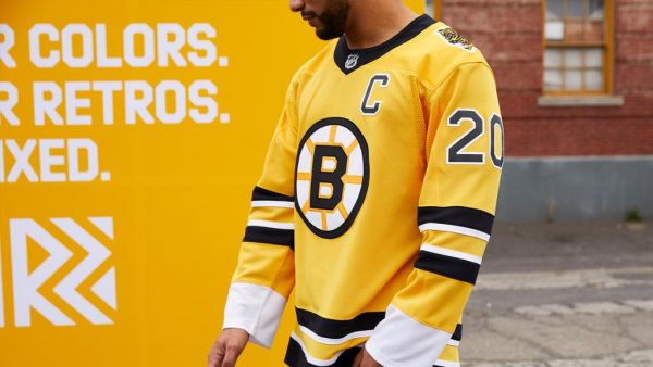
This is where I think things get interesting for the Bruins. The Bruins’ uniforms have changed minimally since the Reebok Edge era in the late 2000s, and many fans have been calling for a change for years. It is not that the uniforms are bad; it just may be time to spice things up, especially with the core of the late 2000s and early 2010s, including Patrice Bergeron and David Krejci, moving on soon.
The popular vote seems to be to bring back jerseys’ design from the 80s when Ray Bourque and Cam Neely were running the show, and I wholeheartedly agree. With many teams bringing back vintage uniforms, the Bruins could join that movement and bring back the classic look with a modern touch. I have decided to design a mockup of what that may look like if Nike takes over.
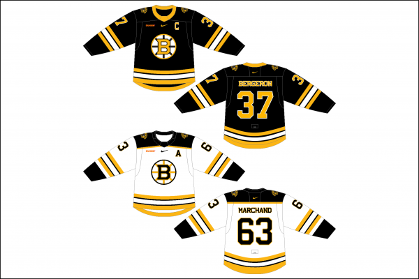
The home jersey’s biggest change from the originals is the shoulder patches. As you can see, I have gotten rid of the crazy “meth bear” from the 80s and replaced it with the current alternate logo, which I am a huge fan of. I also figured that with Nike’s ego, and as they showed with their recent MLB takeover, they would want the Nike swoosh on the front of the jerseys. I also decided to add a jersey sponsor, which in this case is Dunkin. I am not a huge fan of either of these additions, but I had to include them for realism purposes.
On the away uniforms, I feel that I was successfully able to blend the old-school design with the current one, adding shoulder yokes along with the same changes I made on the black set. I was not sure at first how the jerseys would look with yokes, but I really like it. With the home jerseys, I would also like to see the Bruins return to gold socks. The current black ones look much too similar to the Penguins, and the gold socks were iconic.
It remains to be seen who will take over for Adidas and what (if anything) they will change. My vote will be for the Bruins to go back to the design they wore from 1981 to 1995 in some fashion, whether that be a direct replica or a modernized version like the one I have presented here. I am certainly willing to entertain other options, however, but I think it will be hard to improve on the current design unless they go with something retro.

Leave a Reply