( Photo Credit: NHL.com )
By: Josh Houreas | Follow Me On Twitter @JHoureas
A hockey jersey is the identity of the team. When you put it on, whether as a fan or a player, you represent the team on the front with pride and passion. Throughout the 96 year history of the Boston Bruins, the team has steered away from the spoked B more than a handful of times. Eight times as a matter of fact. From worst to best, here’s the countdown (and everyone is entitled to their own opinions about this list).
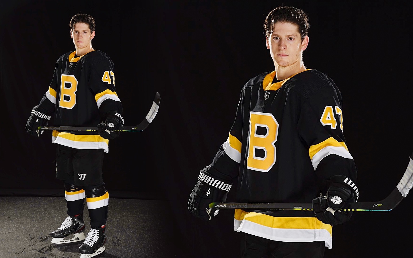
8) 2019-Present Alternate
( Photo Credit: icethletics.com )
I’m putting this one at the bottom of the list because as clean and classic as this jersey looks, it’s extremely basic. There is just a giant B on the chest and almost no standout design on the jersey. I thought seeing this jersey in person would change my opinion, but it didn’t. The Bruins missed their opportunity to make a new alternate jersey that is crisp, clean, and classic. If anything, Boston should have just made their 2019 Winter Classic jersey their alternate, even if they had to only wear it as a road sweater.
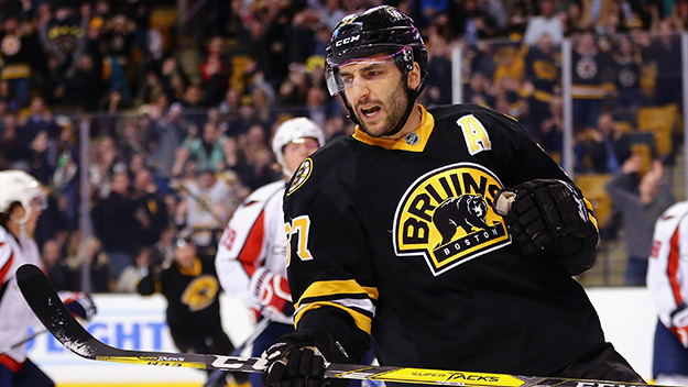
7) 2008-2016 Alternate
( Photo Credit: Maddie Meyer/Getty Images )
When the Bruins had to ditch their CCM/Koho brand jerseys in the 2007-2008 season, they also had the task of coming up with an alternate jersey. Boston took the design of their home jersey, which has basically gone untouched in design (apart from a revamping of the famous Spoked B.) Switched the shoulder patch and main Crest around, and knocked out the bottom three stripes. I actually LOVED this jersey when it came out because I had been dying for a new Bruins jersey to hit the scene. I’m only putting it so low on the countdown because when you think about it, did they really try? I mean, all they did was switch a few logos around and knock out some stripes.
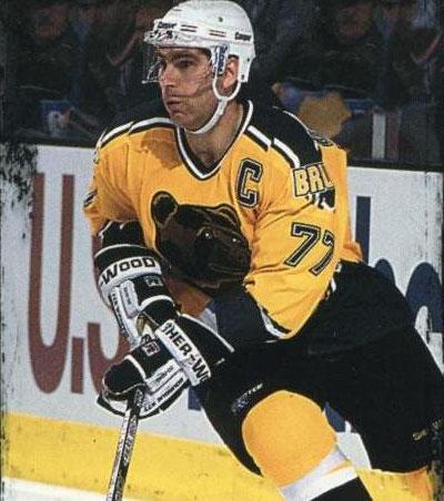
6) 1995-2006 Alternate
( Photo Credit: Berthold’s Thoughts / jbertho.com )
Well, we’ve reached the part of the countdown that’s going to cause the most controversy. They’re yellow, they scream the decade 1990s, and they have a not so fierce-looking bear smack dab right on the front of them. I’m talking about none other than the Pooh Bear alternate jerseys. I have so many mixed emotions about this uniform. The more I look at it, the more I think of god what the hell were we thinking? Put this image in your head. Ray Bourque wearing a yellow jersey, with a bear basically representing the cuteness of Winnie the Pooh. (that’s where the name comes from). My only question is What if the bear had been more fierce-looking, would the Bruins have kept it as their alternate? I’m going to say no because Boston has had plenty of golden opportunities to make a better alternate jersey.
5) 2016-2019 Alternate
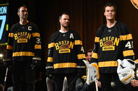
( Photo Credit: SportsLogos.Net )
When I had figured out that the Bruins were going with a 1920s look for the 2016 Winter Classic. Which was a 5-1 defeat to Montreal (and a game that I’d rather forget). I crossed my fingers and prayed they would just bring back a spitting image of their Brown and yellow 1929 Stanley Cup-winning jerseys. Well, I got about 10 percent of what I was hoping for. The logo is probably the most unique of any Bruins logo. The brown bear in the middle is made of a material that pays homage to the hockey jerseys of the 1920s. Felt. Even though the only thing I like about this jersey is the logo, I’m putting it at number 5 because of the historic significance of the uniform.
4) 1991-92 75th Anniversary
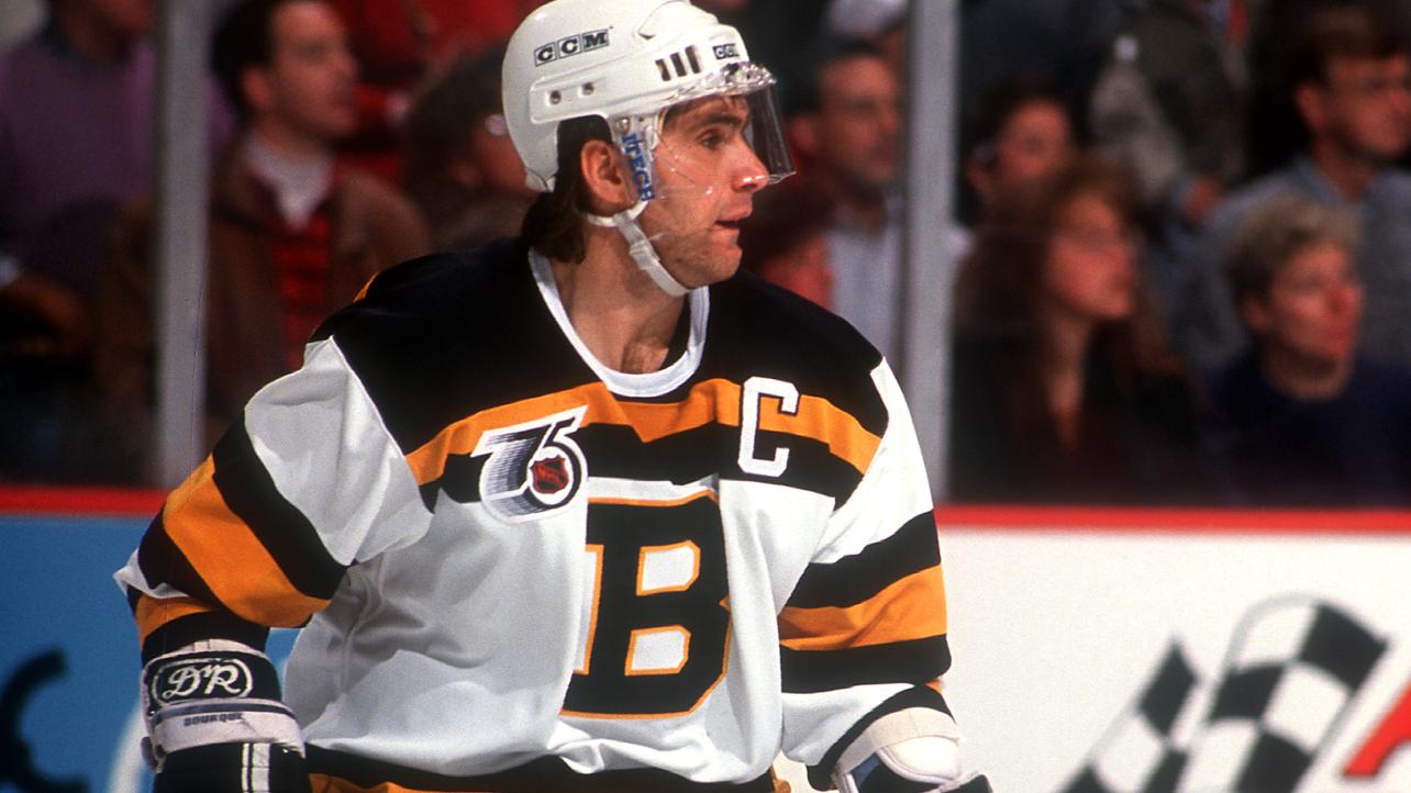
( Photo Credit: NHL.com )
The Bruins, along with the other five original six teams, introduced an alternate jersey that paid tribute to the Bruins sweaters of the late 30s and early 40s. People may or may not remember this jersey as it was only worn for one season. The National Hockey League was celebrating its 75th anniversary and what better way to do it then to have the original six pay homage to their original roots. I love historical significance when it comes to hockey jerseys. If you can design a jersey that tells the history of your team, it’s a winner in my book, and I would love to have this jersey in my collection one day.
3) 2006-07 Alternate
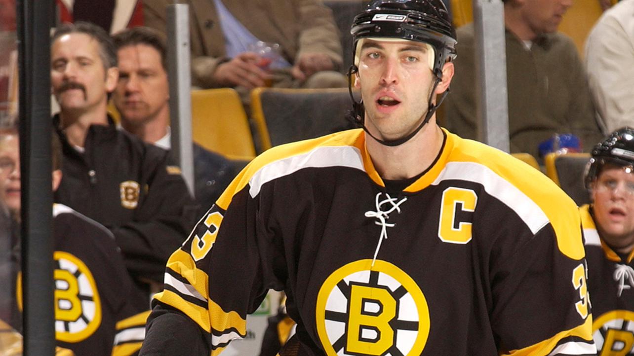
( Photo Credit: NHL.com )
After the infamous Pooh Bear jersey found itself in the scrap pile, Boston went back to a familiar look of success. From 1967-1974, the Bruins would wear some of the most recognizable sweaters in NHL history. 40 years later, the Bruins would bring back memories of the days of Bobby Orr flying through the air, Gerry Cheevers and his stitched mask, and Phil Esposito breaking records some of which still stand to this day. Even though the Bruins only wore this jersey for one season, it was nice to see them embrace a successful part of team history, and who knows, maybe they’ll bring it back for their 100th anniversary in the 2024-2025 season.
2) 2010 Winter Classic
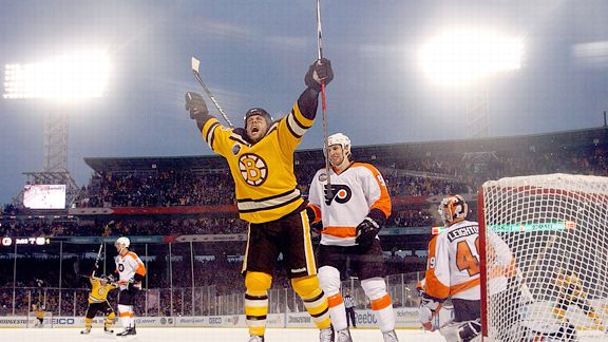
( Photo Credit: ESPN.com )
Unlike their opponents in this game, the Philadelphia Flyers, Boston went above and beyond with these jerseys. In 1948, as a part of the team’s 25th anniversary at the time, the Bruins introduced their world-famous Spoked B logo. This logo looked absolutely amazing and the Brown shoulder yolks and stripes gave that historical significance of the original colors of our beloved hockey team. Even though these jerseys weren’t a personal favorite when they first came out, these jerseys have gained my respect and take the number 2 spot on our countdown.
1) 2019 Winter Classic
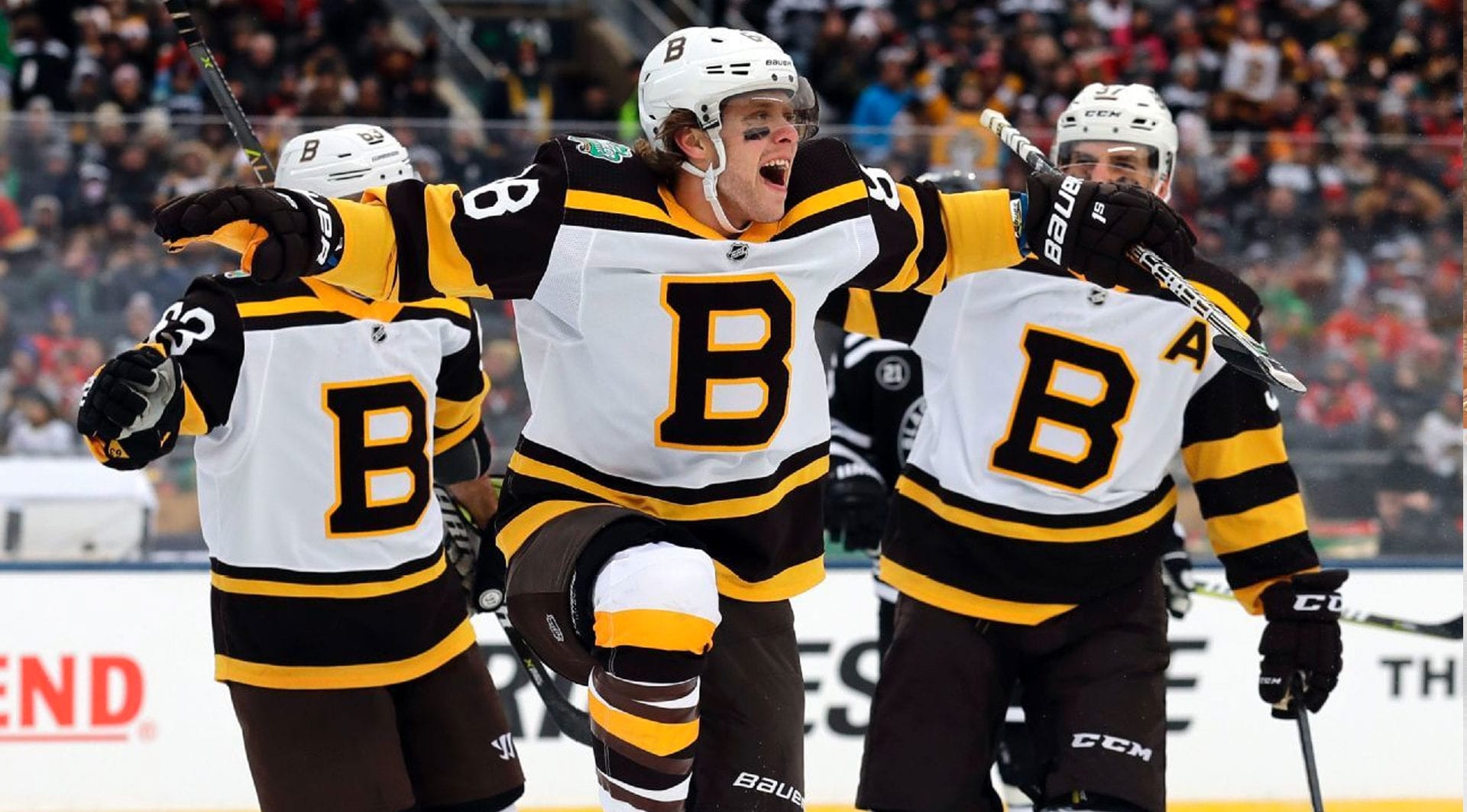
( Photo Credit: CoolHockey )
This jersey has it all. A good design, classic Bruins colors, and hidden messages you probably didn’t notice. The six four-leaf clovers on the inside collar, representing the six Stanley Cup Championships Boston has won is my personal favorite. I’ll give you this time to look at the picture closely and say, “oh, I see it now.” I immediately fell in love with these jerseys the day they unveiled them. If Boston were to ever change their jerseys, I would love to see these in the mix.


Leave a Reply