By: Theo Lander | Follow me on Twitter @lander_theo
The Boston Bruins debuted their Pooh Bear Reverse Retro jerseys on Monday night against the St. Louis Blues. Unfortunately, the polarizing logo has split the fanbase, with some loving the new threads while others loathe them. So, to clarify, I have taken it upon myself to rank the best (and worst) jerseys in the history of the Bruins franchise.
This is my list. There are many like it, but this one is mine.
DISCLAIMER: There are a bunch of iterations of Bruins jerseys that are the same other than one or two small changes so that some installments will be skipped over—also, shoutout to nhluniforms.com for having the most extensive archive of NHL jerseys.
#15: 1935-38
This one is the worst of all the jerseys the Boston Bruins have rolled out. The chest logo has been substituted for a football-esque front number. It just doesn’t have any character to it. This would be a good practice jersey, but it is not fit to be the primary uniform.
#14: 1959-65
While I love the primary logo, the striping is where they lose me with this one. This combination of striping, particularly on the black jersey, is a distracting eye sore. Also, yellow pants are never a good look and certainly don’t work with this set.
#13: 1924-25
Most people hate this jersey for the turtle neck, but I don’t mind it too much. With that being said, this looks more like an ugly Christmas sweater than a hockey jersey, These only lasted for one year, and it’s clear why. However, if Tomáš Plekanec was a Boston Bruin, he’d love these jerseys.
#12: 1995-2006
The Pooh Bear has found its way on the wrong side of this list, but it’s the best of these three jerseys pictured. I would even go as far as to say that this iteration of the spoked-B is the worst logo of the entire bunch. I’m not sure why I dislike it so much, but it just looks bland. The striping on this jersey is also lackluster.
#11: 1926-31
This logo is fantastic. The lettering works here, and the colors do as well. The striped sleeves are a bit ambitious, but this is a fun jersey that deserves some shine.
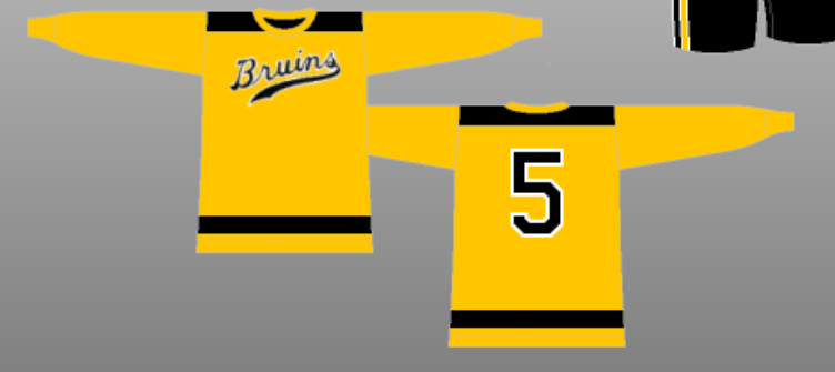
#10: 1940-44 alternate

Again, this logo is a homerun. The font looks great and works well due to its simplicity. However, the yellow is so loud that I’d like to see it broken up more than this. Also, nameplates or sleeve elements would do wonders for this jersey.
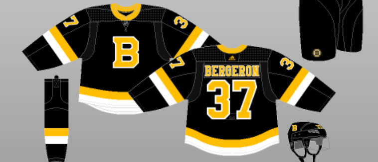
#9: 2019-present alternate

The vintage B logo is excellent, but I prefer black instead of yellow. I also feel as though there is too much white trim here. Overall an uninspired design that feels a bit unfinished.
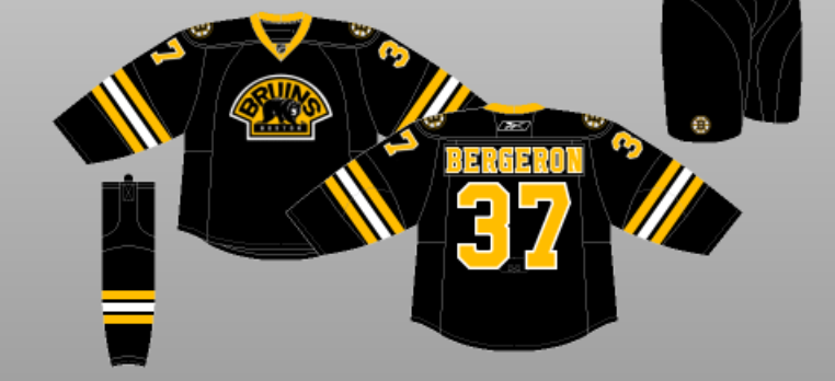
#8: 2008-16 alternate

This is where tough choices had to be made. I love this alternate jersey, but it’s missing some bottom or collar striping. Either of those additions would tie this one together better, in my opinion.
#7: 2016 Winter Classic
These are essentially the previous uniforms but with a worse logo. However, the color of the lettering works well here, which gives it a slight edge over the 2008-2016 alternate. Still, this uniform is easily forgettable, given that the Bruins got skunked by Montreal in a 5-1 loss at Gillette Stadium.
#6: 2010 Winter Classic
This is an excellent example of how to use yellow as your base color. The brown/tan striping breaks this jersey up nicely, and this spoked-B fits the vibe of a Winter Classic sweater.
#5: 2021 Reverse Retro
This is an excellent example of how NOT to use yellow as your base color. However, I will give it the edge over the 2010 Winter Classic due to the shoulder patches and primary logo.
#4: 2007-08
Clean, simple, and to the point. These jerseys check every box without taking too much risk. The logo and mirroring striping are an appropriate evolution of previous iterations. I love how the black outline on the logo makes it really pop.
#3 1991-92 NHL 75th
The stripes on this jersey are jarring, but the logo’s simplicity and lettering make it work. White as the base color pairs well with the large element of black and just a hint of yellow. This jersey is stellar.
#2: 1981-95
This jersey has been the blueprint for Bruins uniforms for the last four decades, and for a good reason. The spoked-B with black, yellow, and white trim has been part of the team’s identity in recent years. These are my favorite versions of the spoked-B, and I have a soft spot for those shoulder patches. A+
#1: 2022-23 Reverse Retro
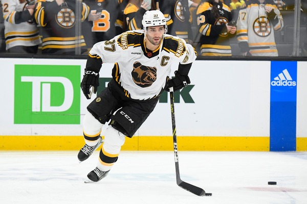
The trim is brash, but so is the culture surrounding this franchise. I also can’t help but give points for the font style, a true example of “if it ain’t broke, don’t fix it” The shoulder patches also mimic the wild vibe of this jersey, all balanced out by the Pooh Bear logo.
People hate the new addition of NHL jerseys advertisements, but I couldn’t care less. I think they don’t distract at all from the overall piece and are appropriately sized. Now, if ads become more prevalent, take up more space, or are colored vastly differently from the theme of the jersey, that becomes an issue. But, until then, I have no problem with their involvement here.
What are your thoughts on these rankings? Comment below or send any complaints here.


Can you order any of these styles and put Your favorite player’s name and number on it ? I am interested in getting Peter McNab number 8 In the 81 to 95. Or the 2223!! Can you point me in a direction or a website?
Can you order any of these styles and put Your favorite player’s name and number on it ? I am interested in getting Peter McNab number 8 In the 81 to 95. Or the 2223!! Can you point me in a direction or a website?