By: Nathan Anderson | Follow me on Twitter @dairybeast
Background
This season in Major League Baseball, six teams have released “City Connect” edition uniforms, with a seventh to be released later this year. As a kid, I loved designing uniforms and logos, and I even created a completely fictional sport just to have an excuse to create more designs. As a result, it was natural for me to see the uniforms released in the MLB and wonder what a similar program might be like in the NHL.
Of course, the NHL is partnered with Adidas and not Nike, but I don’t think a “city-based” uniform program is out of the realm of possibility. I have noticed that a lot of teams in the league are introducing vintage-style uniforms and going away from the style introduced when all teams switched to the Reebok Edge program in the 2007-2008 season.
As a Bruins fan, I naturally started with the Bruins. There are a few directions the team could potentially go in, so I decided to split those up into separate blogs. This is obviously the first of those, so I’ll take you through my thought process in designing these uniforms.
The Design Process
As I mentioned, I had a few different ideas going into the process. I think the initial thought for most people when they think of Boston since 2013 is “Boston Strong,” which tends to have a lot of Boston Marathon roots. This is the path that the Red Sox went down, so I wanted to avoid starting with that, but it may be an option later. The second option I thought of was the strong Irish heritage that is present in Boston. This was an interesting option to me, but not the one I chose to start with.
I ended up settling on the Revolutionary War to base my first design on. As I’m sure most people know, Massachusetts and Boston specifically had a huge presence in the war, and the United States becoming a free country. This also gave me the license to use blue and red, which are obviously the colors used by both the Red Sox and Patriots, so it allowed me to imagine creating a uniform that fits into that color scheme for a third Boston team.
I wanted to design the uniform to look similar to a uniform worn by the soldiers in the Revolutionary War. I did a quick google search to find out what those may have looked like and found an image which I will link here. As you can see in the image, the uniform consisted of a mostly navy coat with red and white trim, and the soldiers wore white pants.
I couldn’t decide on what crest to use on the center of the uniform, so I included four different versions of the uniform with different crests. The first one is probably my favorite crest, but I also like some of the others as well.
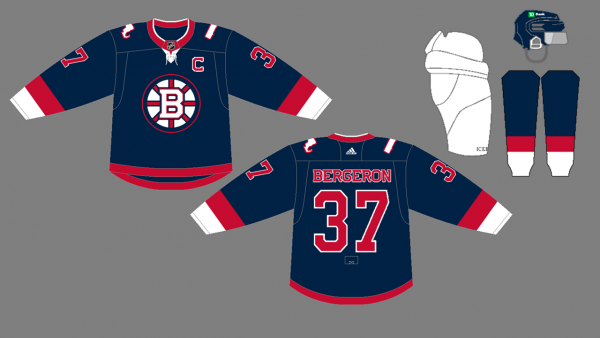
For each of the uniforms, a few things remained consistent. The main body of the uniform is navy, just like the Revolutionary War uniforms. I also decided to keep the white pants, which is an odd look typically in the NHL, but I think a fun series like a “city-based” design would be a great place to try some crazy things.
The first version I made of the jersey was extremely plain. I recolored the typical Bruins crest to match it with the colors of the jersey. On the shoulders of the jersey is an image of Massachusetts filled in white and outlined red. This represents the home state of our beloved Bruins. The uniforms are striped with red and white cuffs, and the socks are similarly patterned to match the sleeves. This was the design I started with before playing around with some other “fun” crests.

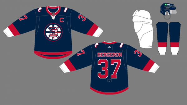
As I sat and stared at the plain crest, I just felt like it needed more. My first thought was to design something like the logos the MLB uses on their Fourth of July hats every year. This typically is some variation of the American flag pattern inside the team’s logo. That is exactly what I did on this jersey, but it looked a bit too busy for my liking.

For the third design, I tried using the flag as the background of the “Spoked B.” I think it works better than the previous design, but I found that the actual spokes had a hard time standing out on this look. I was stumped as to what else to do, however, so I sought some external eyeballs.

After showing my dad the first three designs, he suggested a crest made to reflect the American flag used during colonial times with the 13 stars in a circular pattern in the top left corner of the flag. I really like the way it turned out, and I think the stars add a unique look to the jersey. Despite being the last crest that I designed, I think this one is my favorite.

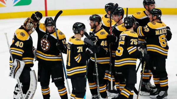
I think it would be really cool to see Patrice Bergeron, Brad Marchand, and Tuukka Rask rocking these uniforms on the ice, and with the introduction of the reverse retro series this year, it seems like the NHL is open to trying some new things! I would love to hear any opinions that anyone reading this might have, either on Twitter or in the comments of this blog.
What other crests could I try with this jersey? What other concepts do you think the Bruins could use for a “city” jersey? Let me know what you think, and I might get to work throwing some of your ideas into a concept!


Leave a Reply