By: Nathan Anderson | Follow me on Twitter @nathandrsn
It is a very dark and stormy day here in New England which can only mean one thing: the Bruins have officially sold out and placed an advertisement on the front of their jerseys. I have a lot of thoughts on the subject, but I will do my best to keep things brief in this article. It seems as though everyone has an opinion, whether it’s rational, irrational, positive, or negative.
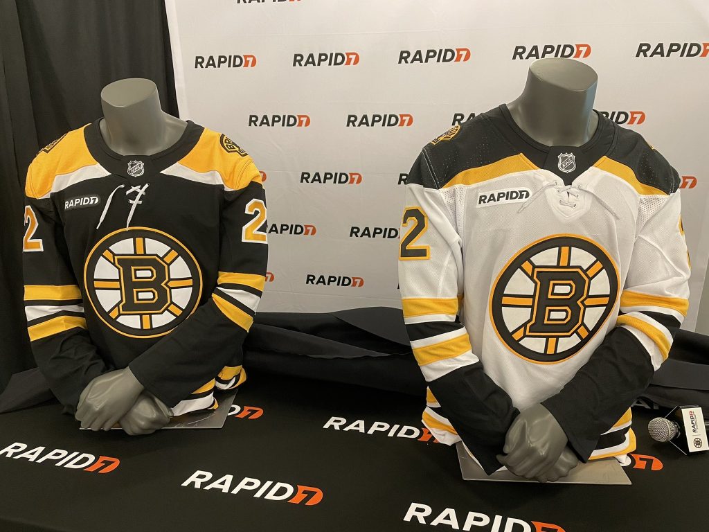
As my BNG colleague Tim Richardson predicted, the advertisement is for a completely random company. It seemed like everyone was hoping the sponsor would be Dunkin, but the Bruins went with Rapid7, who also became the team’s new cybersecurity partner. I have never heard of Rapid7 before today, so for them, it is a great deal to increase awareness of their company. Images of the jerseys with the new ad patch are below courtesy of Ty Anderson.
I’ll get the rational reaction out of the way first so I can start venting about my issues with this development. The ad is not that big. Compared to some of the other ads I’ve seen teams announce, I’d say the Bruins did it reasonably well. It fits the jersey colors, it doesn’t take up too much space, and from a distance, it probably won’t stand out too much.
The ad will provide some extra revenue for the Bruins and eventually will allow the salary cap to increase. That means players will get to make more, which is good for them. The worrying thing from a fan’s standpoint is that the league will not stop with one ad. We don’t want NHL jerseys to look like the European leagues.
Ty notes the other important fact in his thread. These ads will not be on special edition jerseys. Give the NHL credit for that. It would have been effortless for them to insist on using the ads on every jersey, but for a one-off special jersey, it’s nice that they will leave them off.
Now it’s time for my irrational, emotional reaction. I’m not too fond of these ads. What I’m about to say will sound ridiculous to about 99% of people reading this. The ads throw off the symmetry of the jersey.
One of my favorite things about NHL jerseys is that everything has a place. The main crest goes right in front. The captains’ patches usually go in the top left. Any ceremonial patch usually goes in the top right. If the team has a logo that invades the top left chest area, the captains’ patches move to the top right, and the ceremonial patches usually become shoulder patches. These ads throw that off completely.
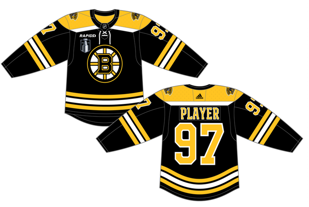
I’ve edited a mockup of what the Bruins jersey would look like if they make the Cup Finals this season. Notice how crowded that top right chest area is. The Bruins are an example of a team that uses every area of their jersey already, so there is nowhere to move the Stanley Cup logo. The alternate logo already covers both shoulders, a captain’s patch would occupy the top left chest, and player numbers occupy even the arms.
This change, unfortunately, marks the end of the clean, efficient design for NHL jerseys. Even with just one ad, we’re going to see this season how jerseys can quickly become cluttered, and some of the most beautiful jerseys around the league will look off when we see replays and camera angles that show the front of the jersey.
The good news is that we won’t be able to notice the ads for most of the game. The usual camera angle that games are shown from doesn’t show the front of a player’s jersey very often, so for the most part, we should be able to tune out the presence of advertisements on jerseys. This ad will likely not be the end, though, as owners will continue to search for ways to increase revenue. Hopefully, fans can make enough noise about these new ads to at least slow down the onslaught of advertisements that will eventually come.


Leave a Reply