By: Nick Parker | Follow me on Twitter @NickParker15
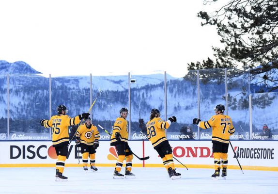
After the Boston Bruins wore their Reverse Retro jerseys at Lake Tahoe, I thought it would be interesting to take a look back into their history of alternate jerseys designs. This will include third jerseys as well as specialty jerseys, such as ones worn at the Winter Classic.
The first alternate comes from 1959, where the Bruins had swapped from a black primary jersey to gold for a few years. This iconic jersey is what Willie O’Ree wore during his time in Boston after breaking the color barrier in the NHL. The jersey design is very similar to the current home kit with the removal of the second set of stripes on the waist. Personal grade B+.
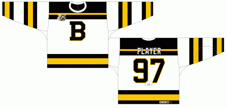
The next time the Bruins incorporated an alternate was the 1991-92 season, where the NHL celebrated its 75thanniversary and brought back classic designs for the original six NHL teams. The design brought back one of the first B logos in the team’s history and featured a black yoke that stopped at the shoulder with a gold line across the front and back. A very interesting choice was to feature the player name without any kind of nameplate, which would have helped with the reading of the player name on the back. Personal grade C.
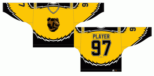
Next up is an extremely controversial alternate jersey that the Bruins made from ‘95-’06. Known as the “Pooh Bear,” after the famous children’s character Winnie the Pooh, these jerseys just scream that the ’90s were a time of interesting design choices. While the gold color being used as a primary color is one of my favorite choices, the strange docile bear, all caps BRUINS wordmark, and the jagged bear claw across the arms and bottom of the jersey are all low points in the design. Too much is a bad thing with the design of this alternate. Personal grade D.
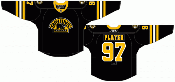
After the lockout season, Boston did not have an alternate jersey again until the ’08-09 season, where they took their secondary logo into the crest of the jersey and put the primary B logo on the shoulders. This design was a very simple but very well done alternate for Boston. They were one of the first teams to bring back an alternate, and after this, the trend of many alternates across the league was going with a black design. The prowling bear crest was one of my favorite designs that came from the logos’ rebrand in the latter half of the ’00s. The numbers and name really popped with this design. Personal grade A.
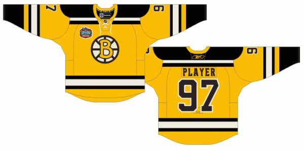
Next up is the first of the Winter Classic jerseys. Boston hosted the NHL Winter Classic at Fenway Park against the Philadelphia Flyers during the ’09-10 season. The jersey design brought back the gold from the 50’s uniforms and was modeled after the 1948 design. This classic design looked really awesome with the backdrop of Fenway Park. The use of a very dark brown rather than black was in homage to the original colors of the team. This design was reminiscent of the jersey Bobby Orr wore in his first years as a Bruin. Personal grade A-.
Following the trend of other teams bringing back retro designs for future Winter Classic games, the Bruins hosted the Montreal Canadians at Gillette Stadium during the 15-16 season. Again they pulled from history the first Bear crest wordmark and went with very simple gold accents. The most interesting part of the design was going with a classic off-white stitched design for the numbers and nameplate. Though the game was disappointing, not only losing to Montreal, it marks the only loss in a Bruins outdoor game. Personal grade B.
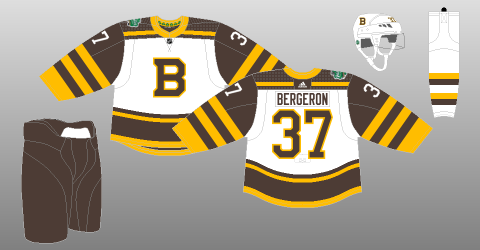
For the first time, the Bruins were the visitor for a Winter Classic at Notre Dame against the Chicago Blackhawks in the 18-19 season. This allowed them to use a white primary design with accents of brown featuring gold stripes. The jersey was very well received by fans for its classic design and the use of the original colors. Personal grade A-.
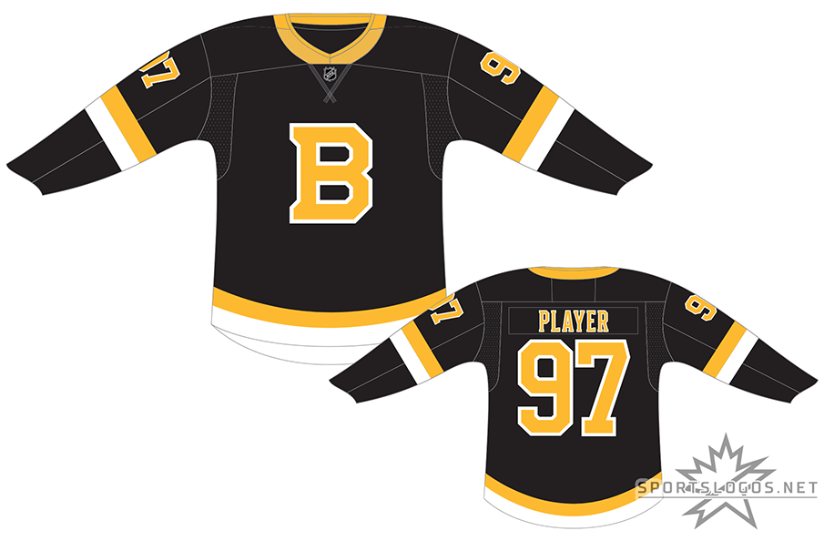
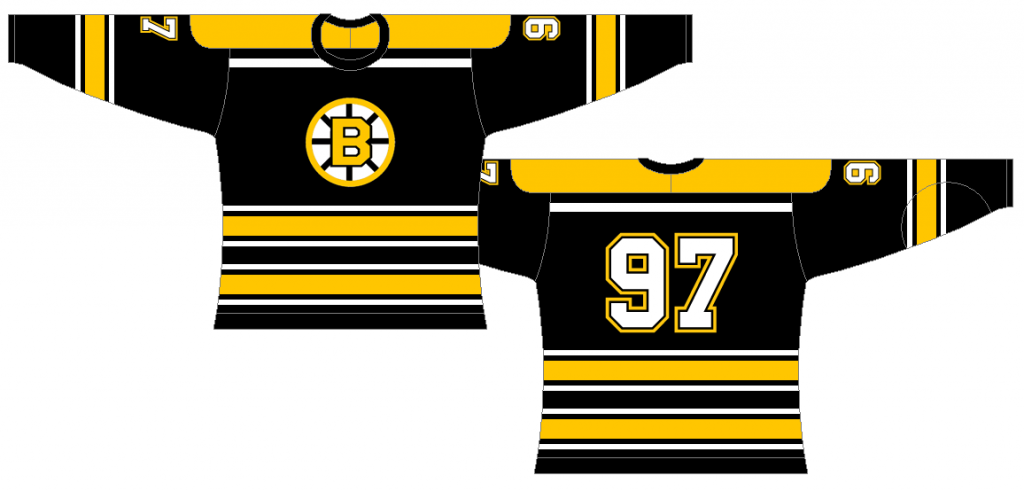
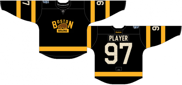
The next season saw Boston take the Primary B logo from their previous Winter Classic jersey and give it a new makeover. With simple double stripes of gold and white of accent with a gold collar, the current alternative is a clean design that looks good when they wear it. My personal gripe is that the use of two black kits is redundant is my one main complaint with this choice of alternate. Personal grade B.
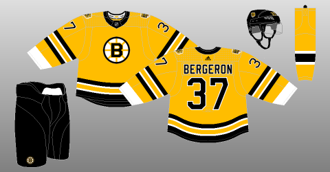
Finally, we get the Reverse Retro design from the Lake Tahoe outdoor game. Boston went retro with a design from 1990 and took their white primary from that time and reversed the colors to make the gold primary. This also brought back the infamous “meth bear” as the secondary logo from that classic 90’s jersey. The jersey looked fantastic with the outdoor backdrop and really stood out for its simple design. This is a design that I would love to see become the alternate in the future or at least be considered for a gold alternate to be incorporated next season. Personal grade A+.
Overall, I have liked what the Bruins have featured as an alternate jersey at various times, and they have been able to pay tribute to the history of the team from various eras successfully. Feel free to comment on Twitter as to which jersey is your favorite that the Bruins have used.


Leave a Reply