By: Nathan Anderson | Follow me on Twitter @nathandrsn
Before their game against the Pittsburgh Penguins on Tuesday night, the Bruins unveiled the logo they will be using for the 2023 Winter Classic. In a surprising twist, however, the logo is not just one throwback, but two! The Bruins appear to be combining styles from two eras for their design, making predicting a uniform design difficult.
First, let’s dive into the logo. The bear is obvious enough. It is a recoloring of the “meth bear” used as the shoulder patch on the Bruins’ jerseys for about 20 years, from the mid-70s to the mid-90s. It was also recently brought back as the shoulder patch for the 2021 Reverse Retro jerseys based on that era. Assuming this is the logo that will be used as the crest for the Winter Classic jerseys, it will be the first time that the logo is used as the primary logo on a jersey.
The “Boston” portion of the logo is a custom font made by Adidas for this event. It is based on the logo used for the Bruins’ 1949 25th anniversary logo. That logo was also inspired for the Bruins’ 2010 Winter Classic jerseys.
Now that we’ve looked at the inspiration for this year’s logo let’s think about what that might mean for the uniforms. We know they will be revealed on November 25, leaving us about three weeks to speculate and put our final guesses in for the jersey.
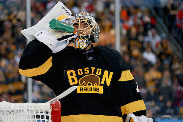
This will be the fourth Winter Classic the Bruins are playing in and their third as the home team. It will also be the second played at Fenway Park following their 2-1 overtime victory over the Flyers in 2010. In their second appearance, the Bruins lost 5-1 to the Montreal Canadiens at Gillette Stadium and bounced back against Chicago, winning 4-2 at Notre Dame in 2019. Of those games, the Bruins have worn yellow/gold, black, and white jerseys in that order. With the 2023 game at home against the Penguins, it is almost guaranteed that the Bruins will wear either yellow, black, or brown.

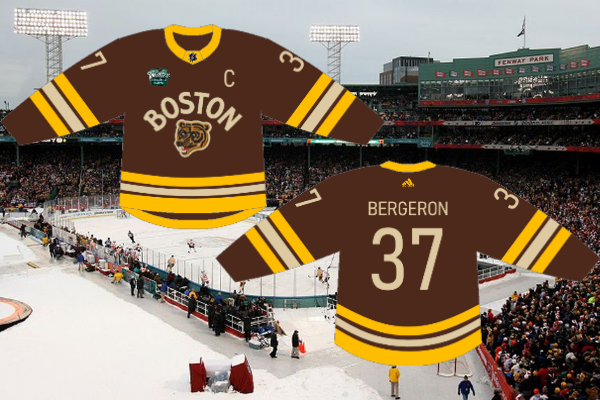
The released logo doesn’t make sense on a yellow jersey, so I’m ruling that out. That leaves either brown or black as the base for the jersey. To me, brown is the most sensible option. First, it is the only color they haven’t used for a Winter Classic uniform yet. Second, they already have two black jerseys in the rotation. Finally, Ty Anderson said the Reverse Retro uniforms would not be worn after December 31, opening the door for the Winter Classic uniforms to be worn as a fourth jersey option.
It makes no sense for the Bruins to have three black jerseys in 2022-2023. It makes even less sense to have those three jerseys in rotation all at the same time! Unfortunately, according to some details discovered by Chris Creamer of Sportslogos.net, it seems likely that black is the direction the Bruins will be going in.
This baffles me a bit because I don’t think they’ll use the exact uniforms they wore in the 80s with the Winter Classic logo, but I also cannot imagine what striping pattern they’ll use otherwise. It seems likely that instead of white, they’ll use a beige or ivory color based on the logo, but I have no idea.
Before learning these new details, I imagined the Bruins would go with brown. That led me to believe they might recolor the design from the 80s with brown replacing black and beige replacing white. I think the jersey looks pretty nice and recolored in that way, but it seems like that is not what we’ll get on the 25th.
The Bruins have already used styles from the 20s, 30s, and 40s as designs for their previous Winter Classic jerseys, so my only guess is that they’ll go for a sweater inspired by the 50s or 60s. Perhaps, they’ll use a design from the Bobby Orr days with this unique logo. At this point, your guess is as good as mine! Unfortunately, we’ll all have to wait until November 25 to find out what the Bruins and Adidas have attempted with this season’s design.


Leave a Reply