By: Nathan Anderson | Follow me on Twitter @nathandrsn
The Boston Bruins are not set to release their official 2023 Winter Classic jersey until Friday, likely before or during their Black Friday matinee game against the Carolina Hurricanes at TD Garden. However, thanks to an impatient retailer and an alert Twitter user, we have a pretty good idea of what it will look like.
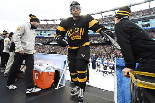
As predicted, the jersey will have a black base under the combined meth bear and wordmark logo. What I did not see coming, though, is that there is only one other color on the jersey. Similar to the 2016 Winter Classic jersey, yellow will be the only striping color on the jersey. There is still a chance that what we saw leak yesterday is not the final or official design, but I feel pretty confident that it is.
I’m going to be brutally honest here. I think this design stinks. I think it lacks inspiration and creativity, and I honestly cannot believe this is the best Adidas could come up with. This looks like a knockoff version of a jersey that a store like TJMaxx or Marshall’s would sell because they want to give people a cheaper alternative to the official jerseys. It looks like a sweatshirt version of the jersey.
I’ve searched hard to find the inspiration for this jersey. The best I can come up with is that maybe they borrowed the striping from the white jerseys they wore in the 1950s. Even then, I feel like I’m stretching to find some meaning or inspiration that isn’t readily apparent.

Another problem I have with this jersey is that it does not fit with the logo at all! It looks so out of place. It’s as if someone found a template created for another team and thought, “oh, these are the same colors as the Bruins wear. That should work!” Maybe they had multiple teams working on these jerseys, and didn’t have any communication between them until the final product was created, and now they’ve run out of time.
Maybe I’m being too harsh on these jerseys. Truthfully, they aren’t the worst jerseys I’ve ever seen. They aren’t even the worst jerseys in the NHL right now. They’re pretty simple, the colors work well together, and the striping pattern is decent. The problem is that these are for the NHL’s premier regular season game. They had about a year to figure out what they would put out for this occasion, and I refuse to believe that this is what won.
As I mentioned in the article, I wrote when the logos were announced; this will now be the third black jersey in the Bruins’ rotation to close out the season. That seems unnecessary and avoidable, but it also gives the Bruins no diversity in their uniform catalog. As of right now, Bruins fans attending TD Garden could see jersey matchups that fall into two categories. First, they’ll see black versus white if the Bruins wear their usual home or away. If the Bruins wear their reverse retro jerseys, they’ll see white versus several different colors based on who they’re playing.
Going forward into 2023, if the Winter Classic takes over as the fourth jersey option, as expected, the Bruins will wear black at home every game. That’s not a problem inherently, but it frustrates me when a team has four different jerseys, and can only come up with two different color combinations.
I’m sure they’ll look fine when Patrice Bergeron and David Pastrnak are flying around making plays wearing them, but I can only be disappointed. Alas, this is the direction the team and Adidas have chosen, so now we can only wait for the official announcement and the subsequent advertisements encouraging us to spend over $200 on this uninspired design.


Leave a Reply