
By: Jack Studley | Follow me on Twitter/X @jackstudley13
Throughout the week, the Boston Bruins officially entered a new era of the franchise. On Monday, two new primary logos were revealed, and on Wednesday, the sweaters that the team will wear both at home on the TD Garden ice and when they are on the road were revealed. The look is heavily inspired by the Bruins’ look from 1981-95, with a modern touch-up, including a refreshed spoked-B and shoulder patch.
The home and road sweaters will feature different crests, as outlined in the primary logo release on Monday. Like the jerseys worn in the 1980s and during the team’s Centennial season, the black home jersey features a gold ‘B’ and wheel, while the white road jersey features a black ‘B’ and wheel. The logo served as the anniversary crest for the 2023-24 season and was featured on the jersey for the Centennial Game on December 1, 2024.
At first glance, the black home sweater resembles the Centennial Game jersey, but the differences are apparent. The sleeve stripe is cut off, so the gold does not extend to the end of the sleeve. The collar is all black, and the patch has been moved back to the shoulder yoke. The RAPID7 advertisement moves back to the chest. The names on the back are gold and outlined in white, similar to the nameplates on the recently retired sweaters. The socks will be black and feature the striping pattern from the jersey, which consists of slightly thicker stripes than the ones the Bruins recently wore.
The white away sweater features the same striping pattern as the home set. It is the first time the Bruins have done this with their home and road jerseys since 1995. A black cuff is beneath the sleeve stripes, and the shoulder yoke is white. The white collar features a black stripe that runs along the top edge, outlining the neckline. The advertisement is in its designated spot on the chest, and the socks will be white; however, the striping pattern has not been confirmed yet.
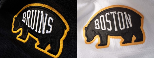
Both jerseys feature one shoulder patch and a new logo inspired by a recent design. This bear was first released with the Bruins Centennial logo, drawing inspiration from the first-ever Bruins logo from 1924. The bear has been recolored black, with a gold outline. The bear on the home jersey will say “BRUINS,” and the bear on the road jersey will read “BOSTON.” The logo will appear on the left shoulder of both jerseys. The Bruins opted for one shoulder patch per jersey during the 2023-24 Centennial season and will return to that design with these new sweaters. (We can act surprised in a few years when a TD Bank ad appears on the other side.)
The pants are all black and feature the gold wordmark logo that the Bruins revealed last summer. The Bruins used this logo throughout the past season, alongside the recently retired logo, and it was also featured on the pants of the Centennial Game uniform. Given its use with both logos and its recent release, it was a safe bet that this logo would remain through the rebrand.
The new Bruins jerseys also feature commemorative hem loop labels that read “BRUINS” on the home set and “BOSTON” on the away set, similar to the shoulder patch. The Bruins’ press release also confirmed that the TD Bank sponsorship will return to the helmets and remain on them yearly until the end of the 2044-45 season.
Although the Bruins revealed the rebrand to fans throughout the week, we saw the home jersey ahead of the official reveal on Wednesday. In March, CBC News’ Doug Gelevan and his crew visited Saint-Hyacinthe, Quebec, and toured the factory where authentic NHL jerseys have been produced for the past 50 years. In the video, the black home jersey was leaked, and after Wednesday’s reveal, it is safe to say that the CBC News report caught the factory in the middle of producing the new Boston Bruins home sweaters.
The Bruins’ rebrand is the team’s first complete overhaul since the 2007-08 season when Reebok took over the production of jerseys. The recently retired logo comes to mind when you hear about the careers of Zdeno Chara, Patrice Bergeron, and Tuukka Rask. It is forever engraved in hockey history with the 2011 Stanley Cup win. However, the Bruins are turning the page to the new era. “Built by Boston. Powered by Tradition” is the Bruins’ line introducing the refreshed logo. The Bruins describe the line as a truth, not a platform or tagline, focusing on embracing the Bruins’ heritage and turning it into “forward-looking fuel.”
Regarding the rebrand being complete, Bruins President Cam Neely said, “I can’t see a change any time soon, but if we’re involved in some other outdoor games, we’ll probably introduce something else.” Well, the Bruins are taking the ice outdoors in February. The team will be on the road at Raymond James Stadium for a game against the Tampa Bay Lightning, so we will have to wait and see what the team comes up with for that game. Last year, the Stadium Series jerseys were unveiled a month and a half before the game. So, while the rebrand is complete, we’re still expected to be treated to one more Bruins sweater for the 2025-26 season.
If there was any perfect time for the Bruins to refresh their brand, it was now. Fresh off the hire of first-time NHL head coach Marco Sturm and leading up to Friday’s draft, where the Bruins will select seventh overall, the Bruins’ rebrand will help usher in the new era of Bruins hockey. Handing the new sweater to the seventh overall pick can represent the beginning of the franchise’s next chapter. The rebrand is not a drastic change but comes at the right time; it combines elements of the team’s history while keeping the eight-spoked B at the forefront.


Leave a Reply