 (Photo Credit: Fenway Outlet)
By: Evan Michael | Follow me on Twitter @Evan007onTV
OK, let’s be up front about this article: it’s IMHHO — In My Humble Hockey Opinion. So please don’t opine too much if you fancy any of the featured logos herein and think my take, as well as a few supported others, isn’t anything you want to “B”-lieve in. Then again, I think that’s what makes this whole exercise both fun & historic, if not a bit histrionic; if we can highlight the “Best Bruins Logos” then why not take a stab at lowballing the alleged losers along the way!? So, without further ado — and starting in the past and working our way to the present–may I present as my present to you (yes, that’s an excessive homonym homage) the WORST BRUINS LOGOS… IMHHO!
1944: The “Curse”-ive Look
 (Photo Credit: Boston Bruins Alumni)
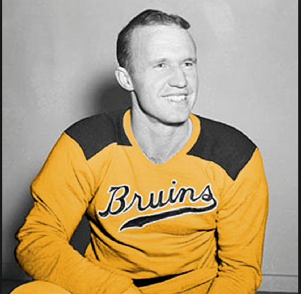
Feel free to be a lil’ scowley when looking at Bill Cowley in his mid-40’s team photo (or just curse at the cursive like I did). That’s because the B’s thought writing collegiate script on a mustard bottle would be a good team logo look. LOOK AWAY, I say! Even when current Bruins D-man Torey Krug tried to bring this look back a few years ago as our friends at Stanley Cup of Chowder pointed out, it still didn’t **hack it.
**(Not to be confused w/ the Hackett pictured here whose similarly colored third jersey & logo could’ve made this list…but alas did not for the soft space in my heart that a certain cuddly crest continues to keep! Photo Credit: Getty Images)
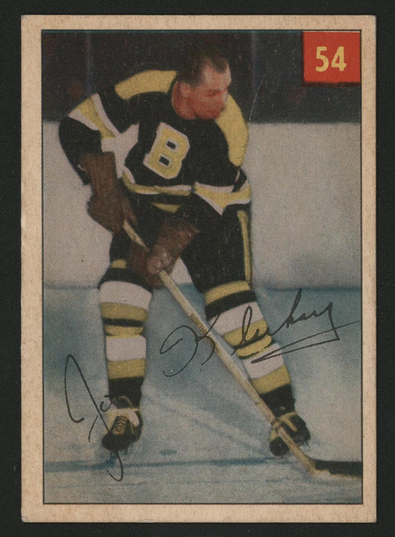
1951: We’ve Seen This “B”-fore!
 (Photo Credit: Third String Goalie)
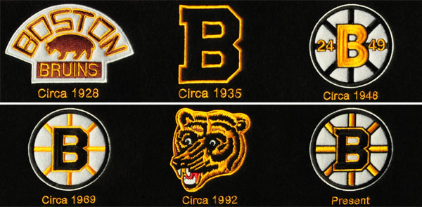
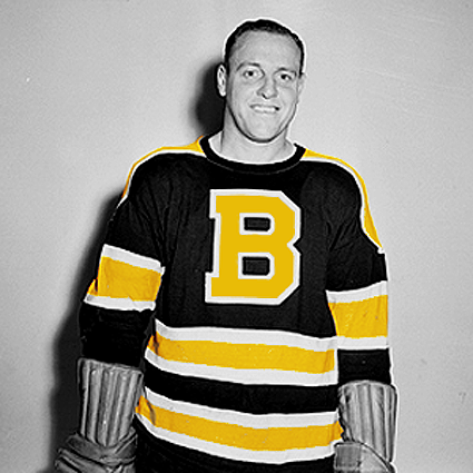
GREAT SCOT! Not even Doc Brown would approve of Adam Brown’s logo look from the 1951-52 season. Fittingly, the second-highest scoring Scotsman in NHL history didn’t have to wear it that long as the picture above was from his final year in the NHL. What else should’ve had some finality to it? This overused big, bold (and now gold) “B” on the front of the team’s jersey for half of this decade. I gave credit to the brown & black “B” from Boston’s inaugural decade for historical import in my previous article as you may recall. But to recall it back and with such brightness against the black? Yikes. Then again, opposing players we’re probably blinded by the glare of it off the ice so maybe it was more successful & sought after. And for goal-happy players, **A-Ok!
**(Not to be confused with Joe Klukay whose Lucky Premium Parkhurst Postcard from 1954-’55 was probably returned to sender faster than his puck-moving skills! Photo Credit: BMW Sportscards)
1976: Can You “Bear” It?
 (Photo Credit: Game Used Only)
No, I can’t bear it. In fact, I find it unBEARable! Why don’t we just Mike Milbury it in the annals of bad Bruins logo history!? Yes, I know this could sound like sacrilege considering the new secondary bear logo added in 1976 stuck around with the team until the B’s moved into the FleetCenter in the mid-’90s. That’s when our aforementioned friend “Mr. Cuddly” came into exuberant existence on not only the shoulders of B’s players, but also the third jersey front for a few fun years.
As real as the Boston Bruins “real” bear logo. pic.twitter.com/65tZ8cuIFt
— Jen Carney (@_jencarney) February 28, 2017
But let’s get “real” like the tweet above comparing ridiculous sporting logos and go back to this supposedly beloved “Bruin”… I just find it a bit freaky looking, that’s all. It’s more carnival Canis and at best erstwhile Ursus (sorry I went all genus, species, Latin here… 4 years of it in high school). Not to mention the fact that Yahoo! Sports ranked in among the “Top Creepy Logos” in NHL history, LOL! I guess to take one positive away, current B’s management icons Cam Neely & Don Sweeney survived wearing it all their careers before it **petered out of existence.

**(Not to be confused with Pete Peeters, the professional puckstopper who proudly portrayed this painstaking patch for pivotal playoff positioning in his prime playing performances! Photo Credit: Game Worn Auctions)
So, there you have it! A logo look back on the logistics of Bruins fashion — from jerseys to patches to crests to lettering to numbering and everything in “B”-tween! What are some of your least favorite B’s looks when it comes to the team logo? Let us know on social media using the hashtag #WorstBruinsLogos!


0 Comments
4 Pingbacks