By: Kyle O’Rourke | Follow Me On Twitter @korourke_15
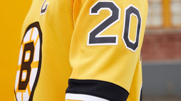
On Monday, as part of their exclusive partnership with the National Hockey League, Adidas unveiled 31 “Reverse Retro” jerseys for each of the NHL clubs. As a team with a deep, rich history, the Boston Bruins offered many different options for Adidas to play around with. Ultimately, they chose to go with these classics:
Built for Boston’s Diehards.
— Boston Bruins (@NHLBruins) November 16, 2020
Introducing the #NHLBruins adidas #ReverseRetro jersey.
Hitting the ice in 2021. pic.twitter.com/ByUAXVZGh0
Before I pitch in my two cents on the new sweaters, I want to quickly mention how much anticipation there was for leading up to today’s reveal. As my fellow Black N’ Gold writer, Evan Michael, discussed recently; there were multiple eras that could have been represented by these alternates. Fans and companies alike took turns creating their own mock-up designs and providing their best guesses for what the Bruins’ throwback would look like.
While some of the creations being circulated around the Internet were easy on the eyes, others were particularly hideous as well as incredibly unrealistic. However, it is hard to fault those folks trying to decide what era an Original Six team will choose to pay homage to. With so many logos and uniform styles to sift through, you have to wonder how they didn’t jump ship and create a mock-up for the Vegas Golden Knights and their grand total of two logos. So, stick taps to those who attempted to guess the direction Adidas would head with the Bruins’ sweaters.

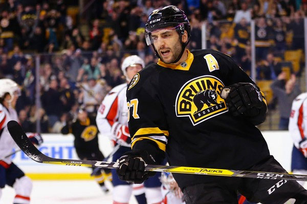
Now, for my personal take. Let me first express that I always have, and will always, love and defend the Bruins’ thirds from earlier in the decade (shown above). Seeing the home team come out of the tunnel wearing those beauties for a matinee contest was always awesome. They will forever be my favorite alternate uniforms that Boston has donned.
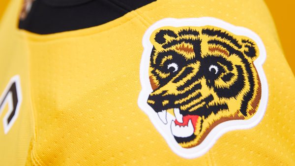
However, the “Reverse Retros” comes pretty close to achieving that mark. I am a big fan of what both Adidas and the Bruins have done with these. They paid homage to the classic white home uniform from the 1980s and 1990’s while also incorporating the ever-popular “Meth Bear” on the shoulders.

Boston has not featured a gold jersey since their 2010 Winter Classic matchup with the Philadelphia Flyers at Fenway Park. The Bruins dramatically won that game, so maybe the gold will continue to serve as a good omen for the club.
It should also be noted that, according to Carolina Hurricanes Vice President of Marketing and Brand Strategy, Mike Forman, the creation process for each of these designs is over a year-and-a-half-long.
Fun 31-team launch by @adidashockey yesterday. FWIW, most individual uniform design processes are a minimum 18-24 month build-out from ideation to the ice so a league wide campaign like this has been a long time coming. https://t.co/9KHm8Zdyx7
— Mike Forman (@MForman5) November 11, 2020
Whether you love the jerseys, hate them, or are somewhere in the middle, you have to appreciate at least the work that went into getting them on the backs of NHL players. Hopefully, this is not the last of these unique collaborations.


Leave a Reply